april 2015 | by susan jurasz
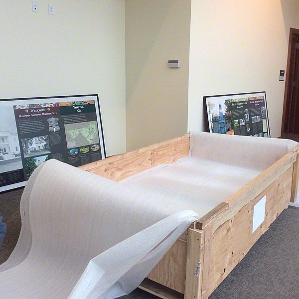
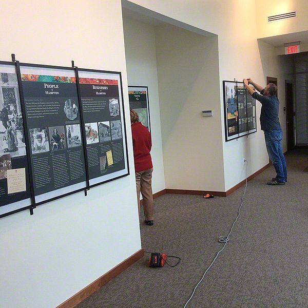
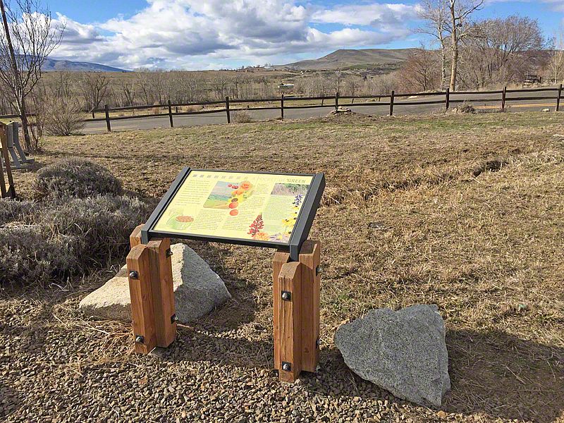
Installation is the final step in a long and detailed process. It’s very rewarding to see the exhibits settle into their proper place and function, and we have gotten good at it.
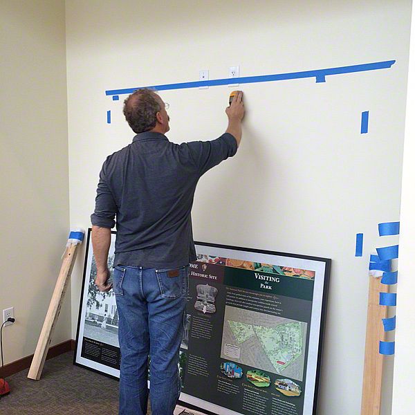
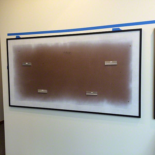
Installing exhibits is all about trouble-shooting and problem solving. We have a saying at Sea Reach: nothing will go as planned, so plan for the everything! The wall may not be plum, the studs might not be 12, 14, or 16 inches on center, or maybe the concrete pad never got poured … it will happen. But when you feel confident you can find a solution, this situation proves interesting, even exhilarating—encountering an in-the-field problem and solving it before it is even perceived as a problem.
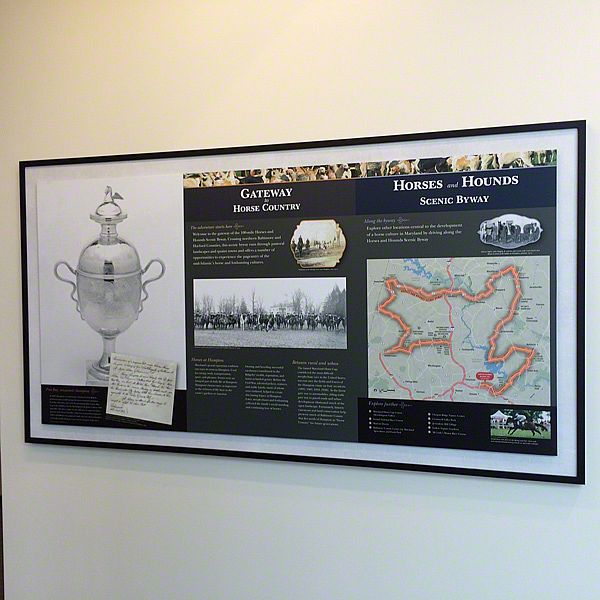
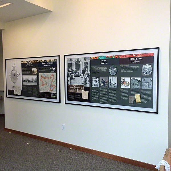
When our installation of exhibits at the Hampton National Historic Site went off without a glitch (without even a trip to the hardware store, or a moment of hesitation!) Peter and I looked at each other with that recognition—that neither one of us should say a word, lest we jinx the great fortune we were experiencing.
In retrospect, all the normal idiosyncrasies of an installation occurred—the wall was, indeed, not plum, the studs were inconsistent, and the intended set of hardware did not work as well as the back up set. It’s just that we were prepared.
