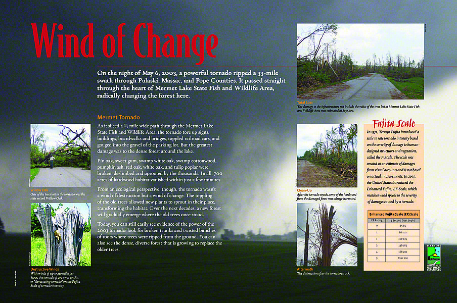
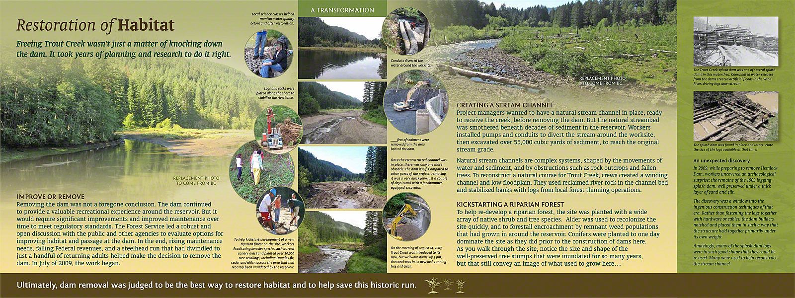
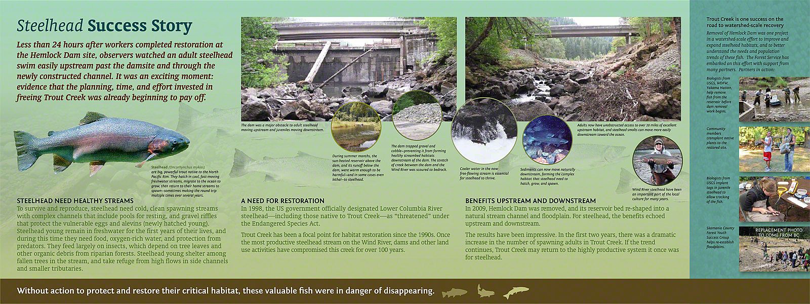
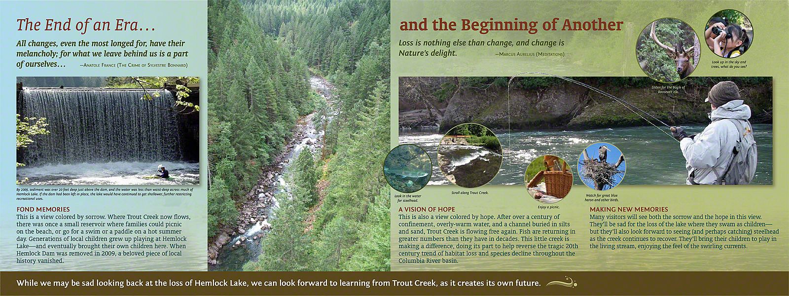
march 2014 | by peter reedijk
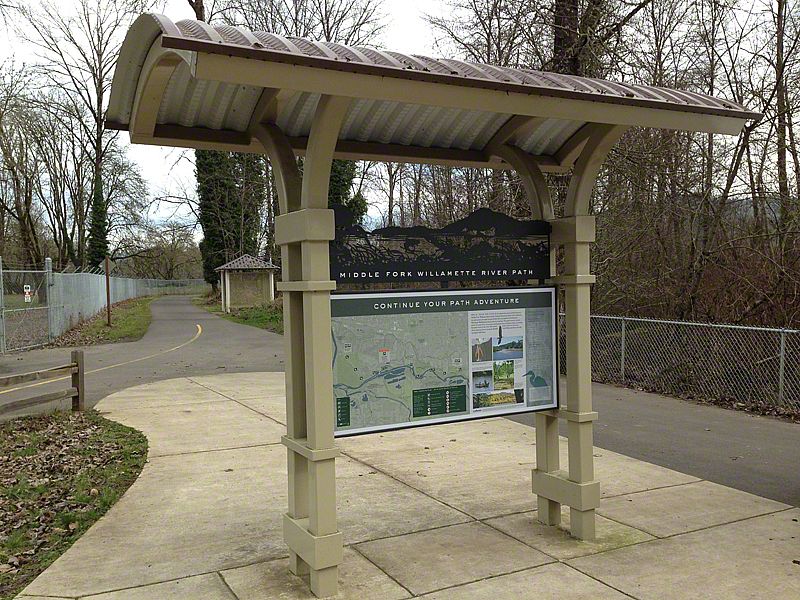
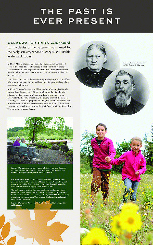
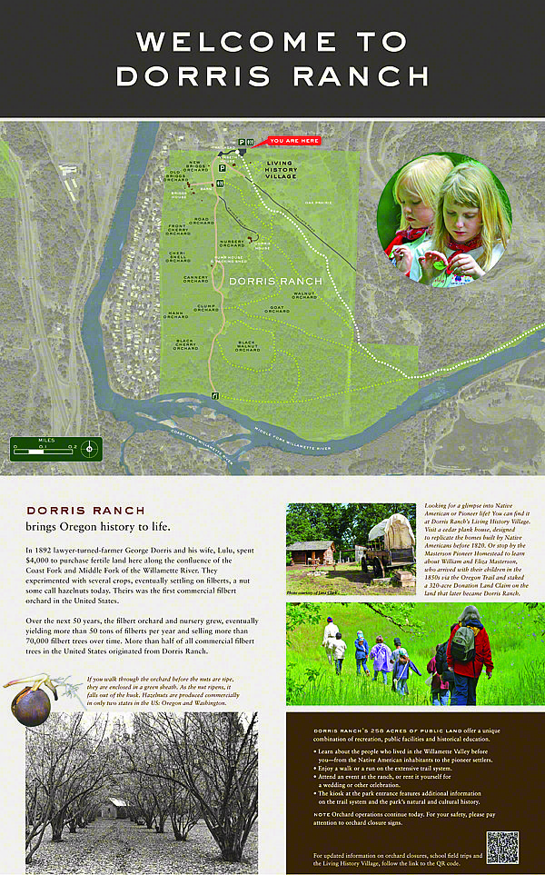
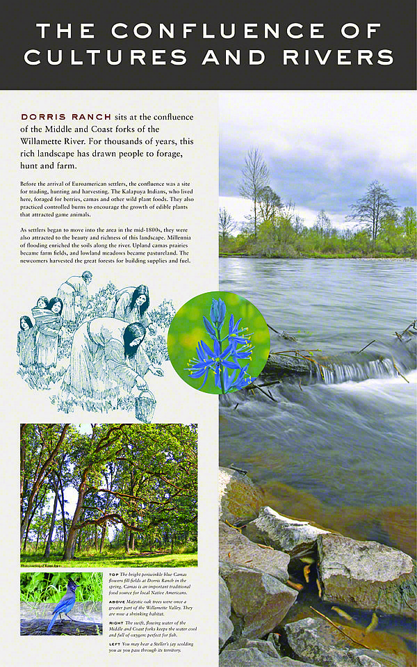
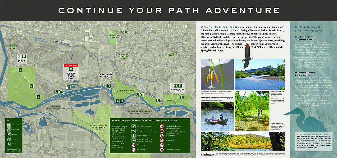
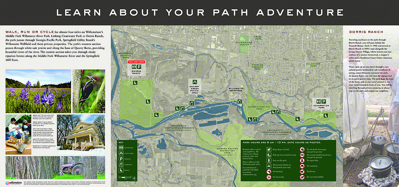
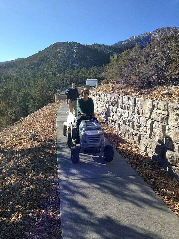
After years of planning and paving, the last section of the Middle Fork Path is open to the public. The 10-foot-wide pathway now runs from Clearwater Park all the way to Dorris Ranch, opening up a previously inaccessible stretch of the Middle Fork Willamette River.
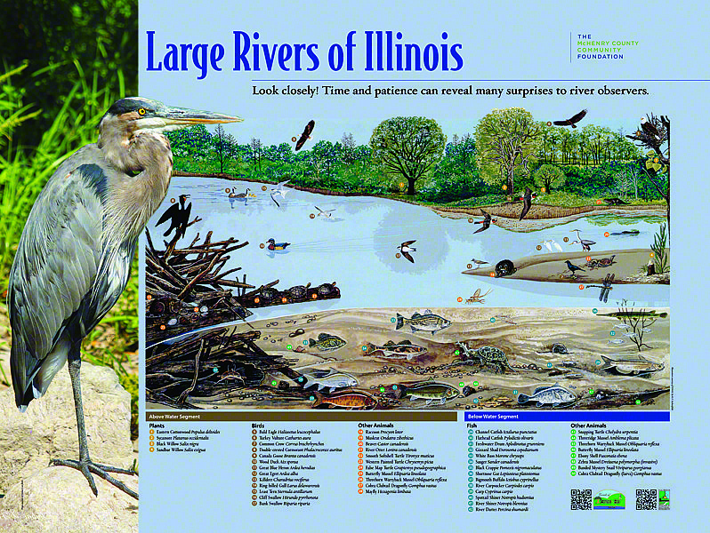
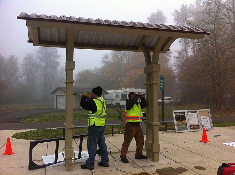
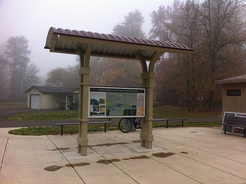
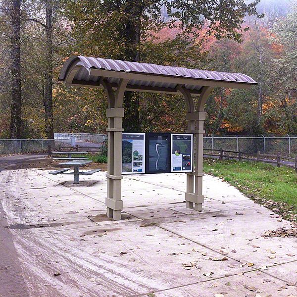
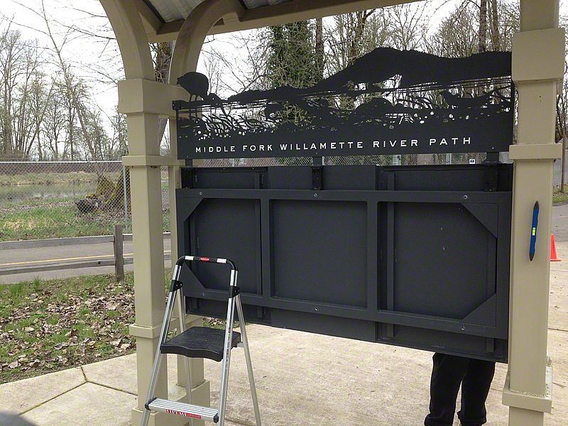
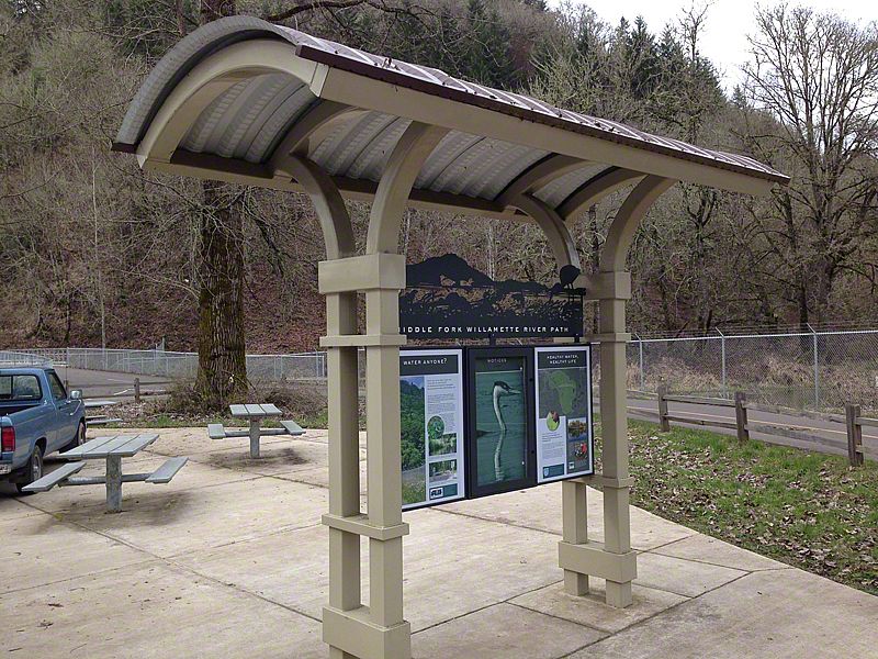
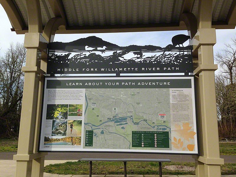
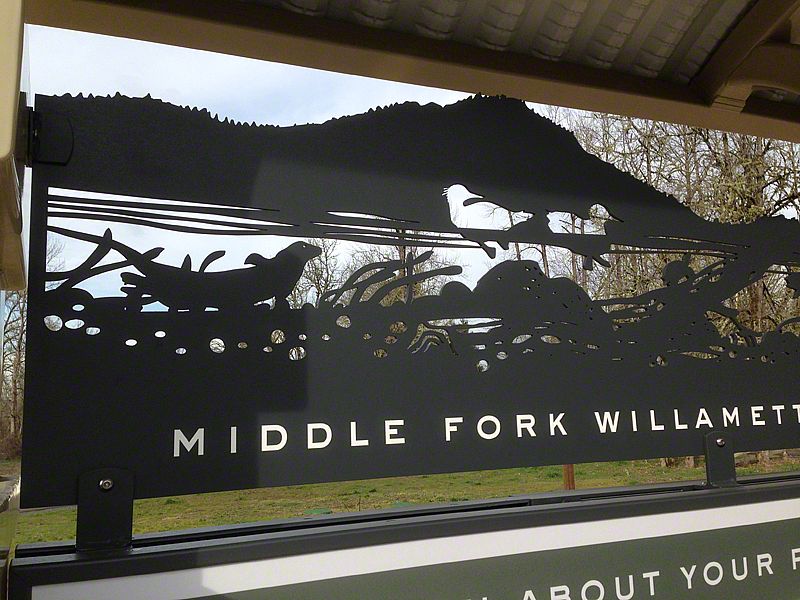
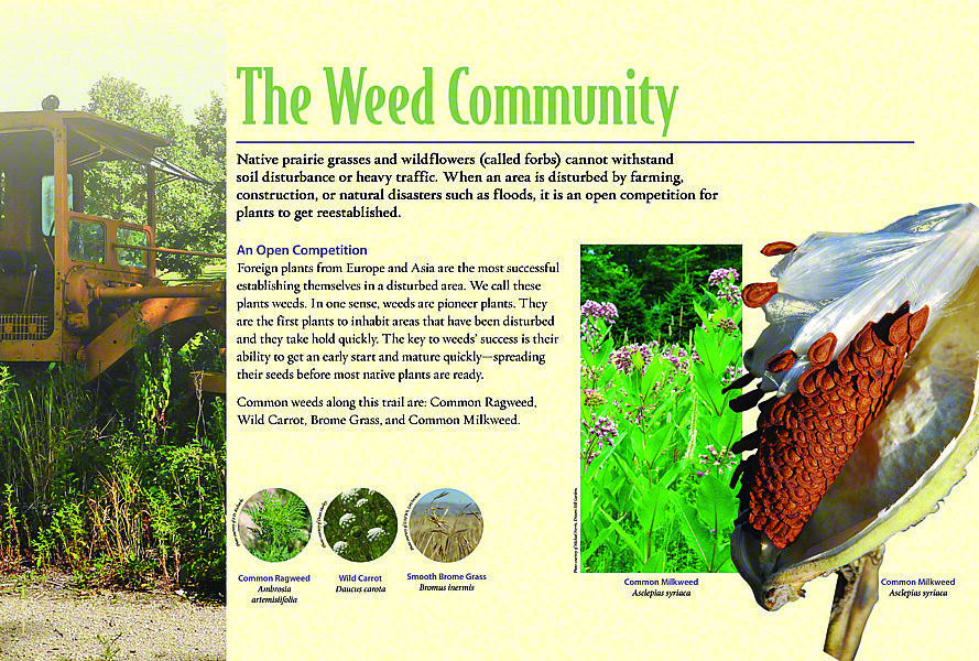
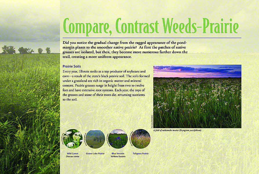
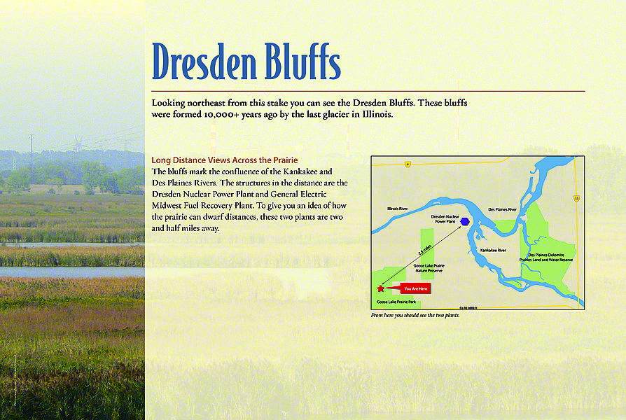
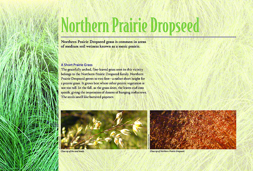
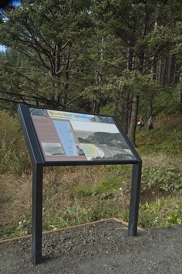
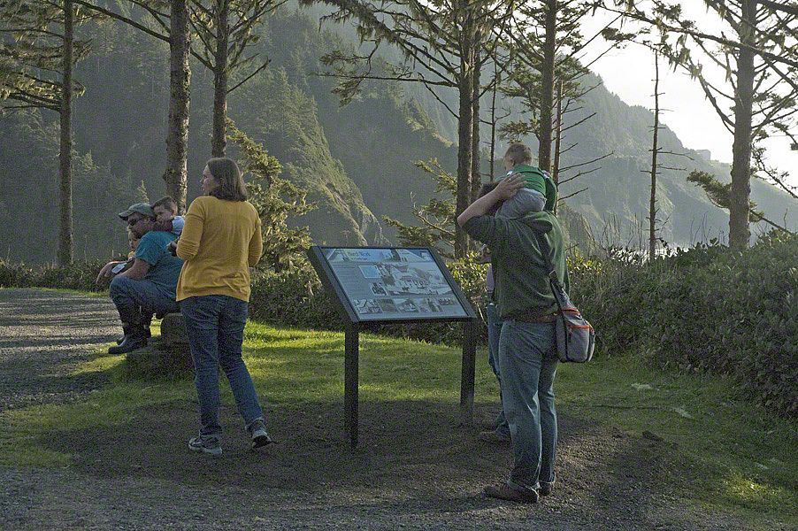
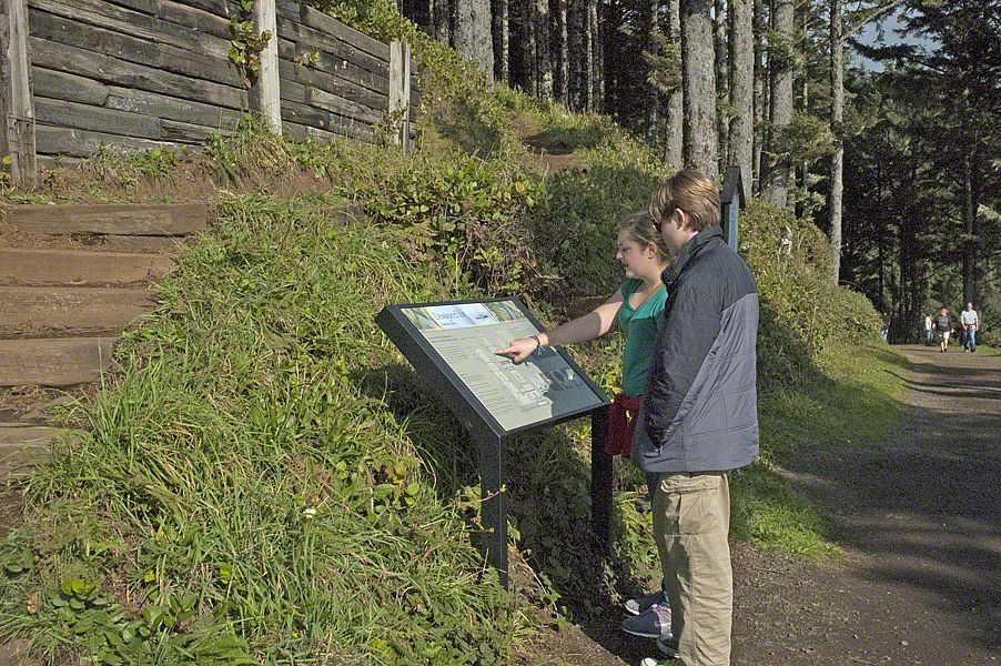
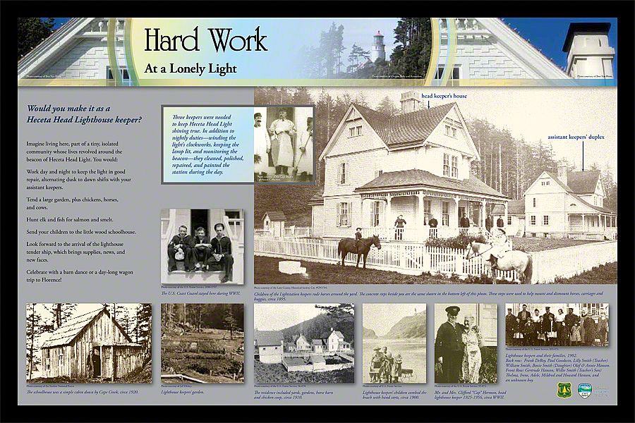
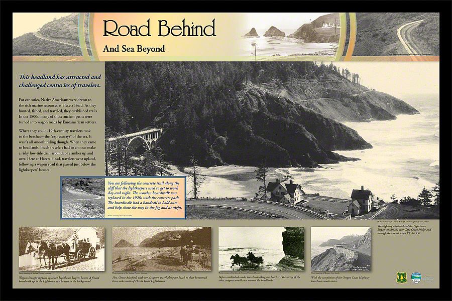
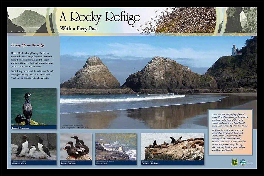
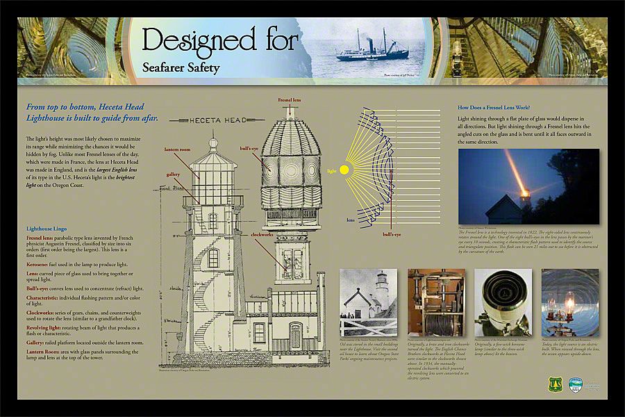
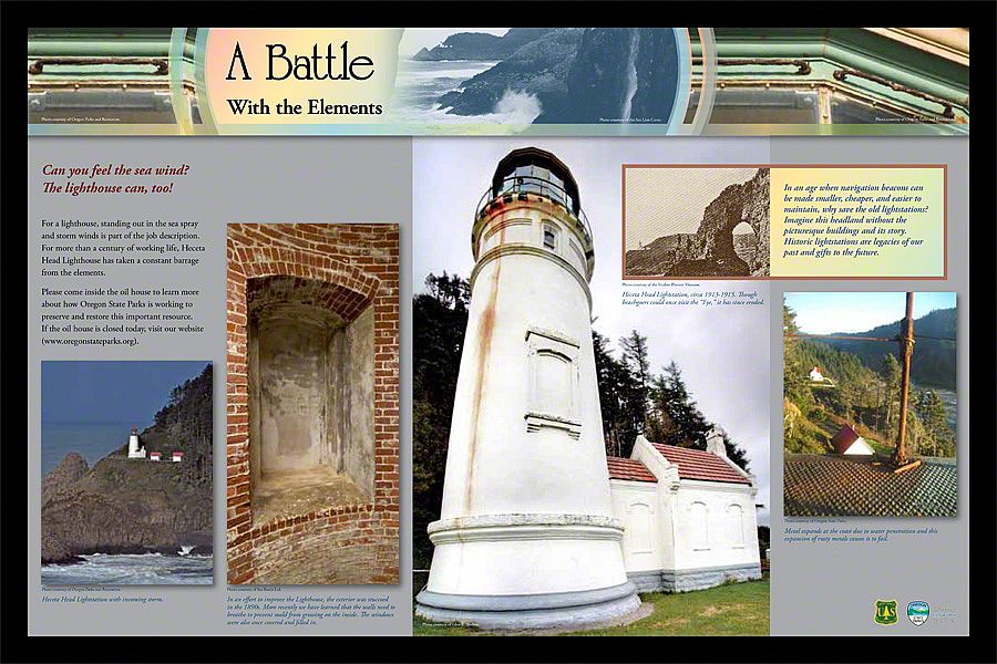
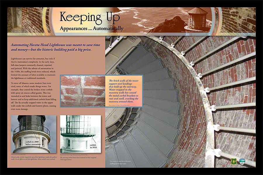
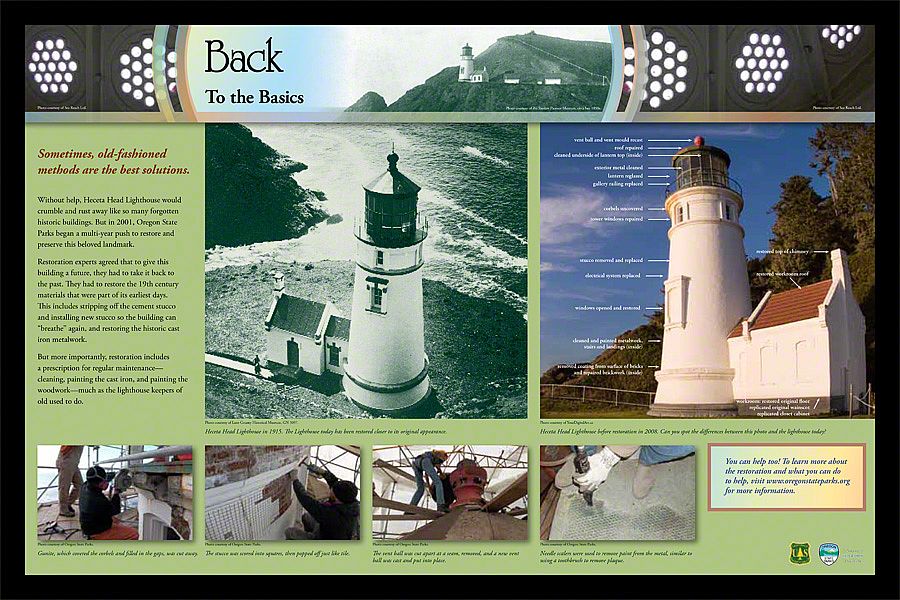
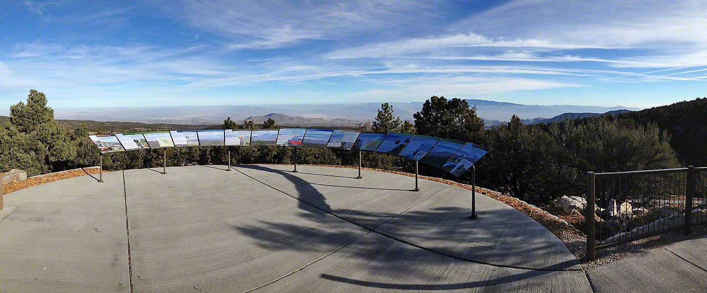
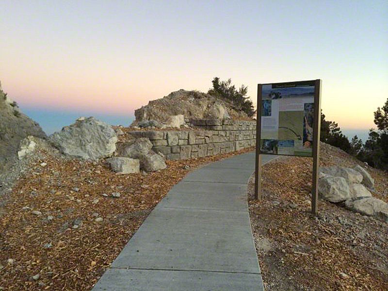
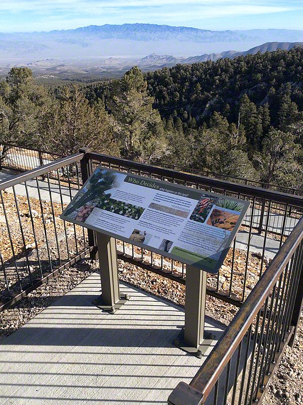
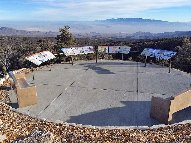
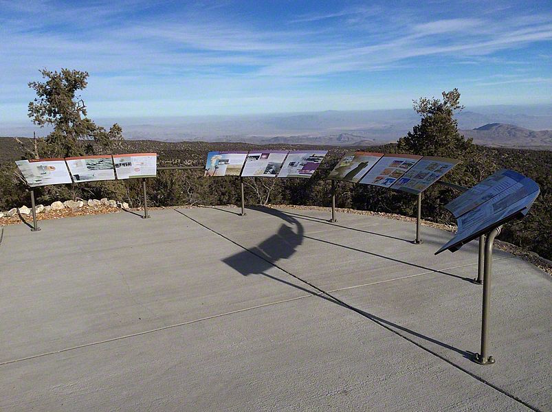
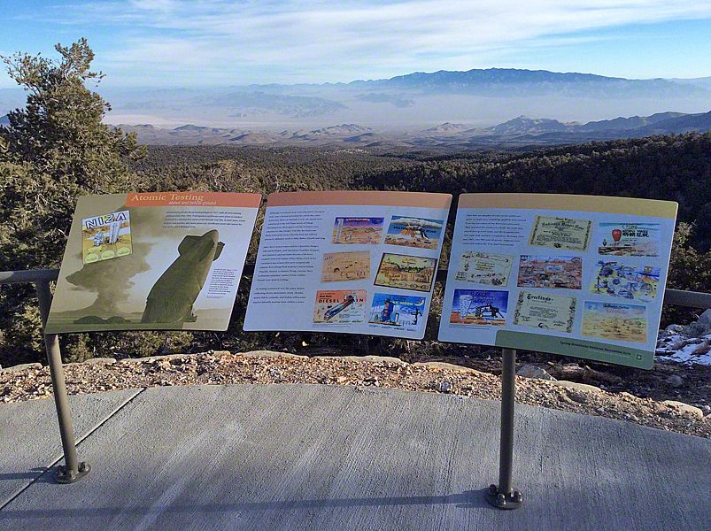
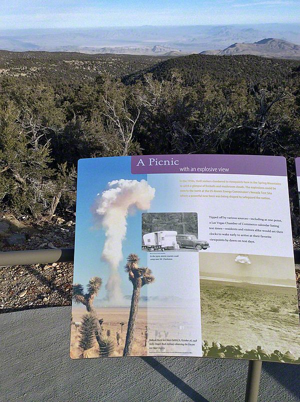
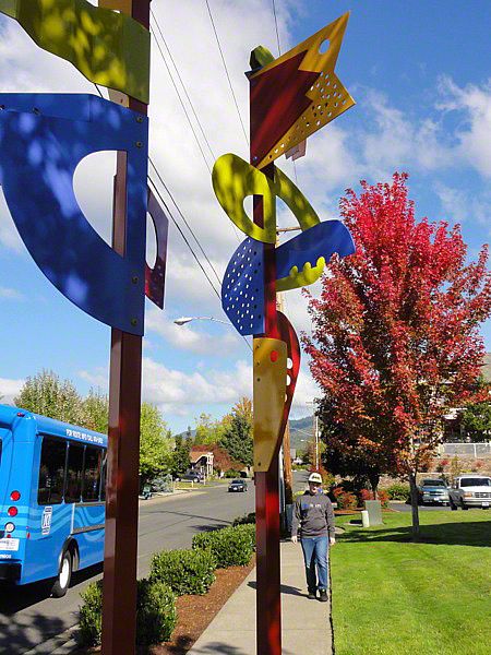
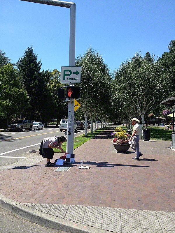
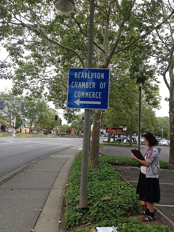
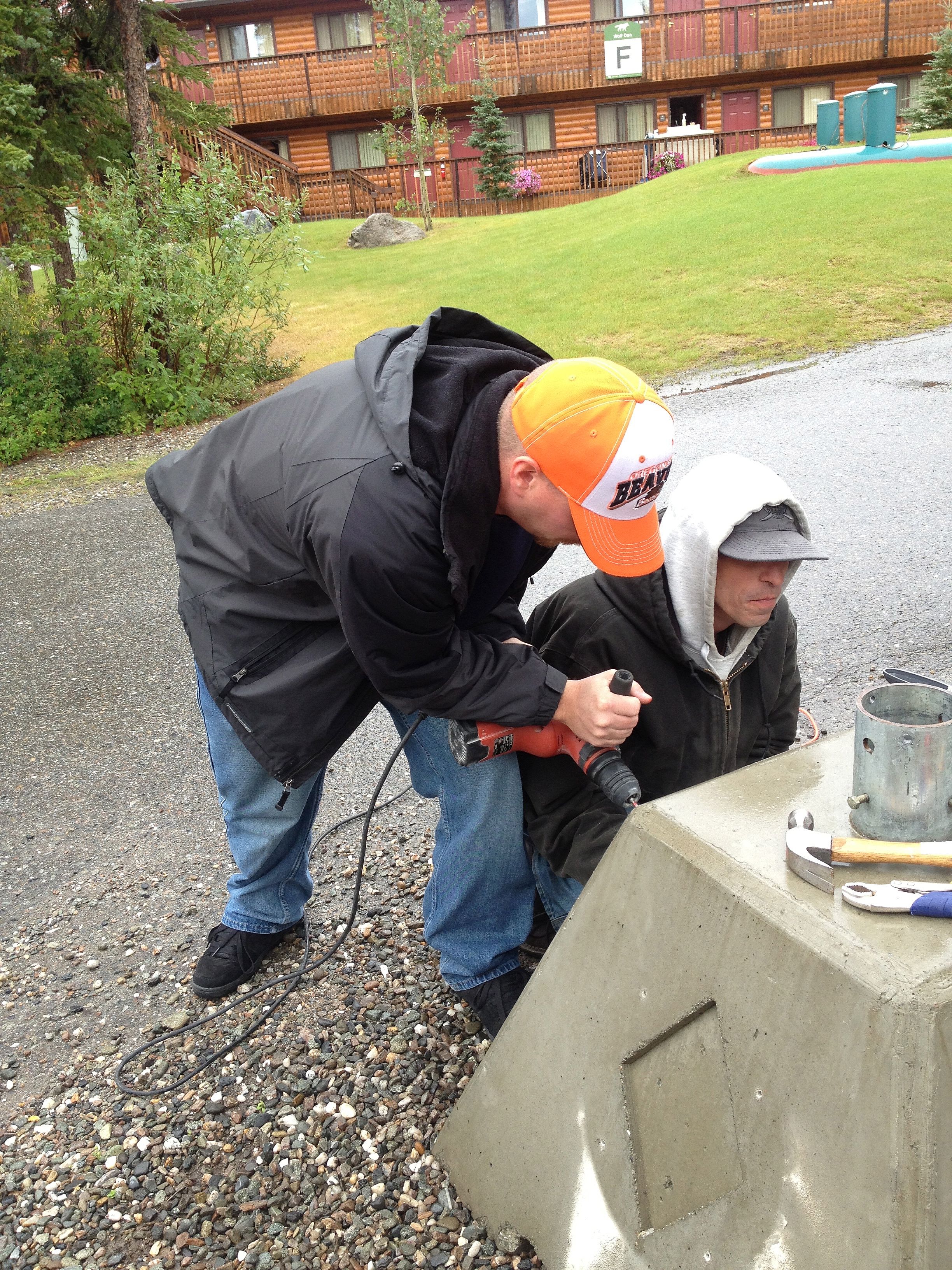
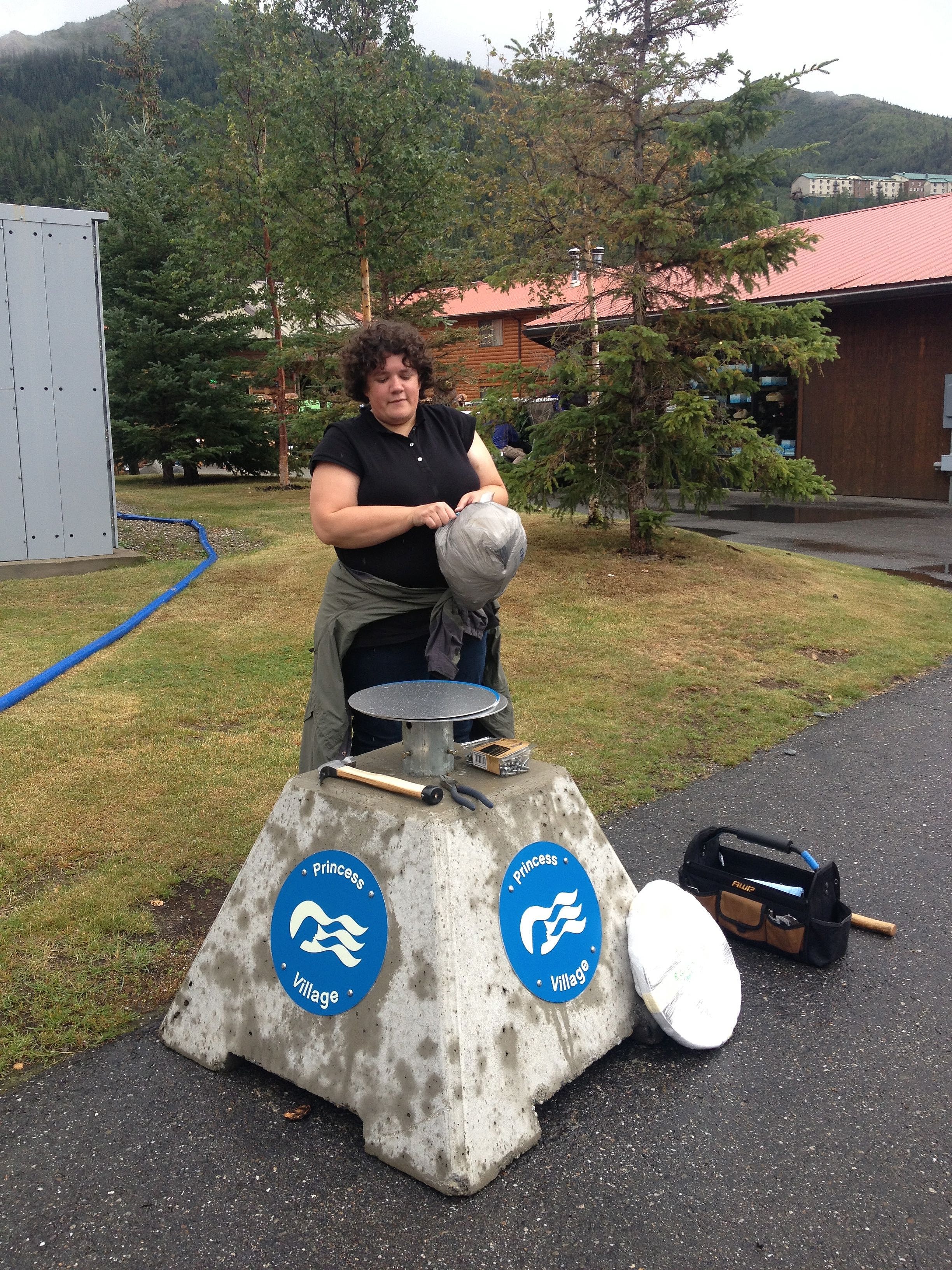
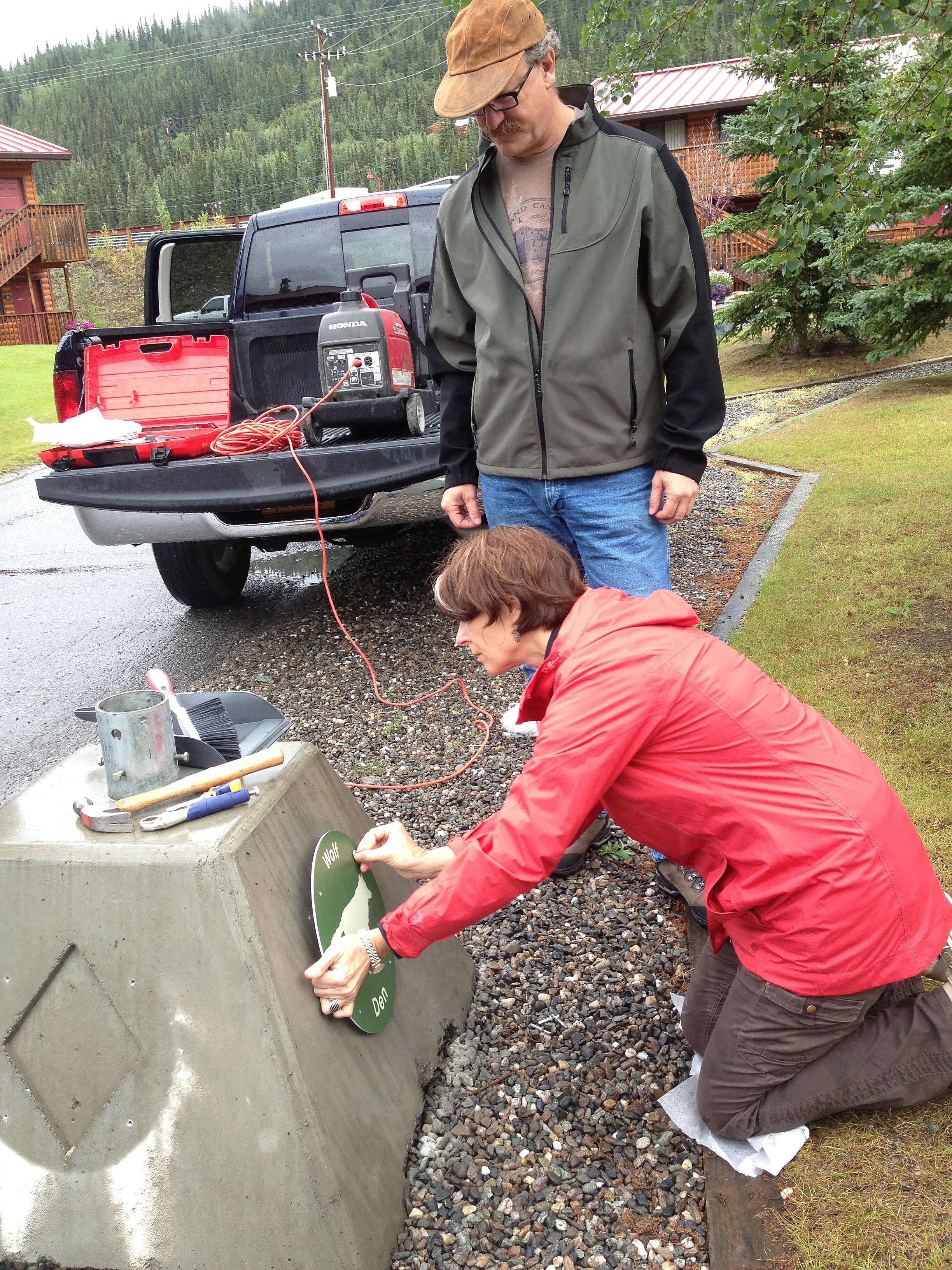
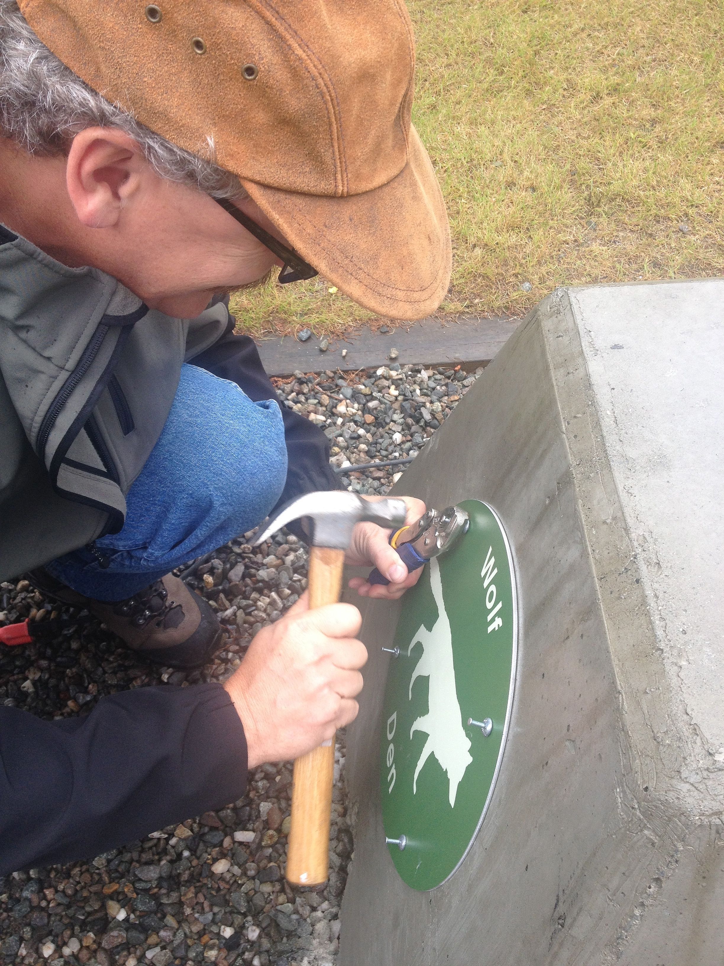
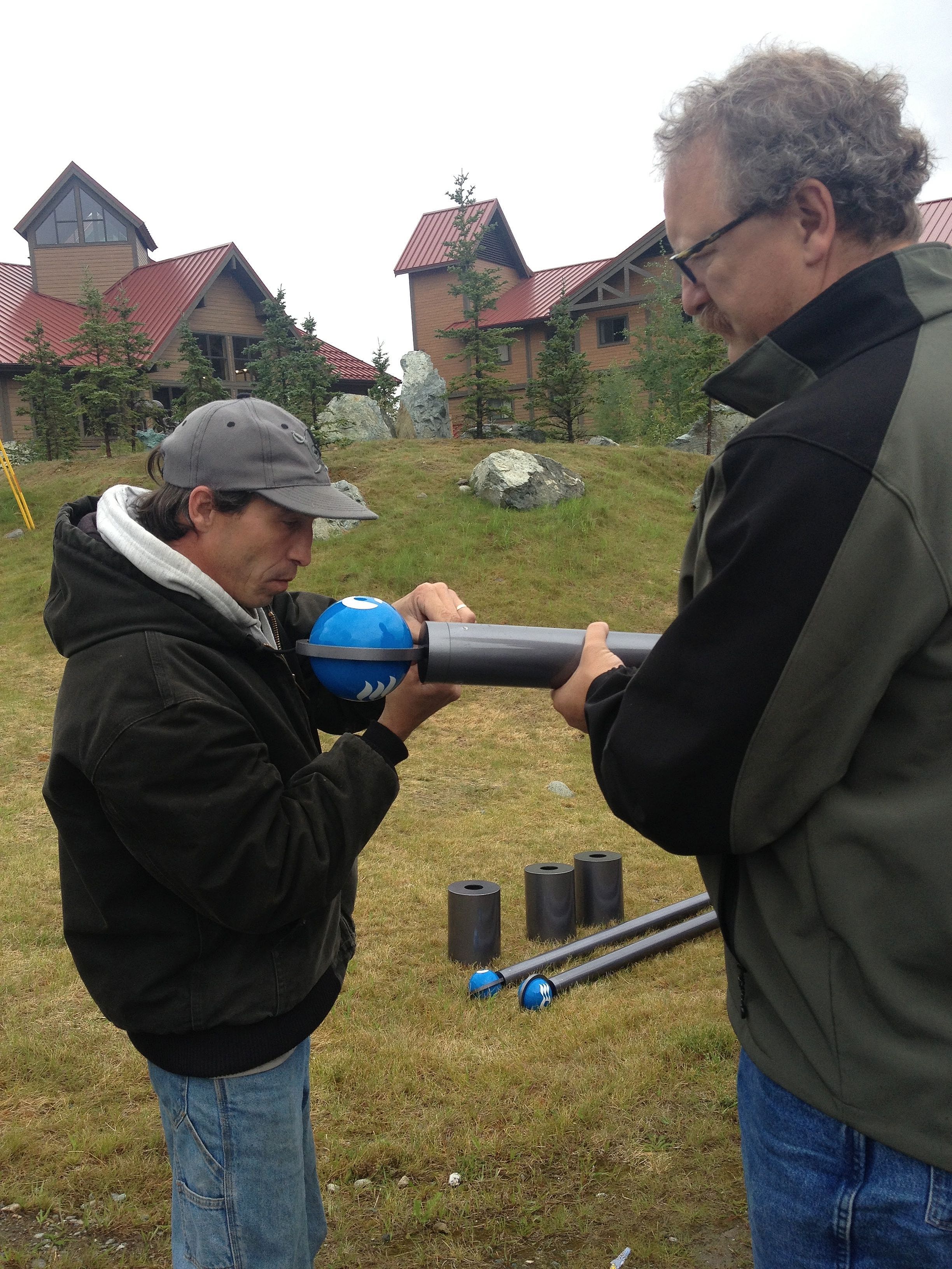
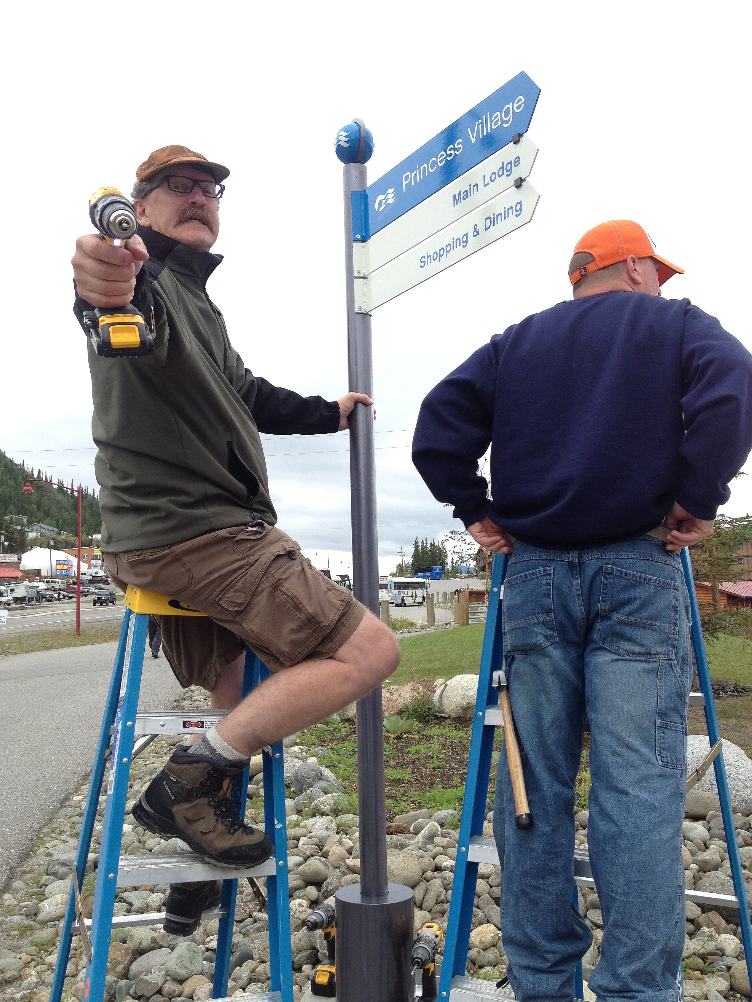
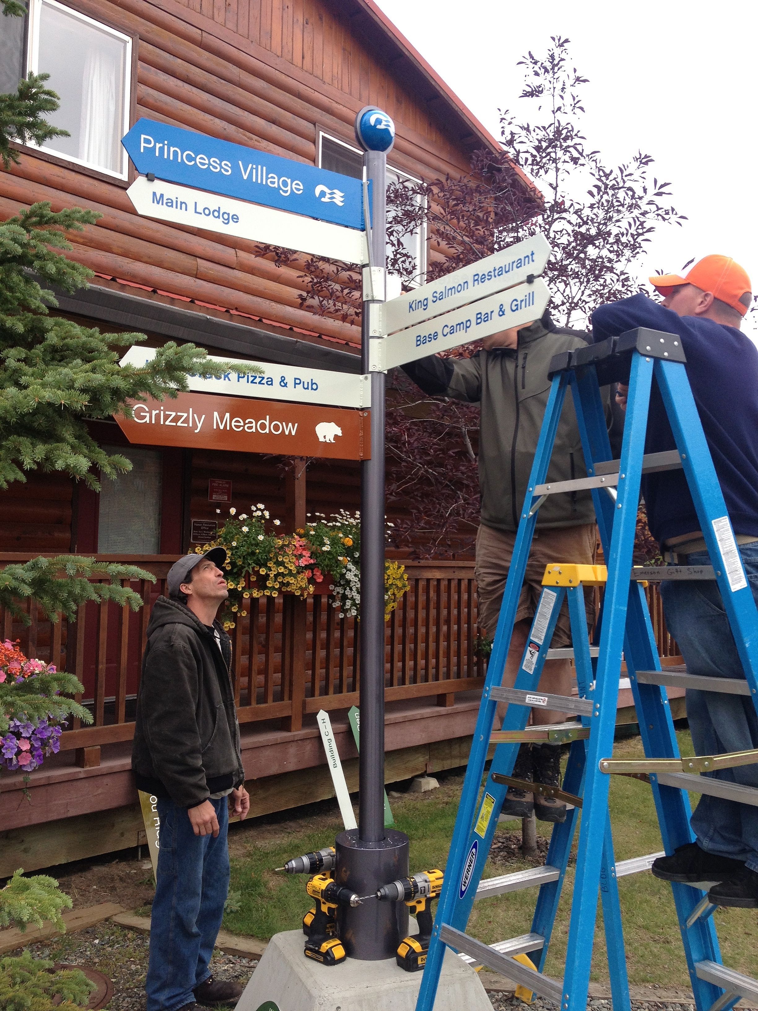
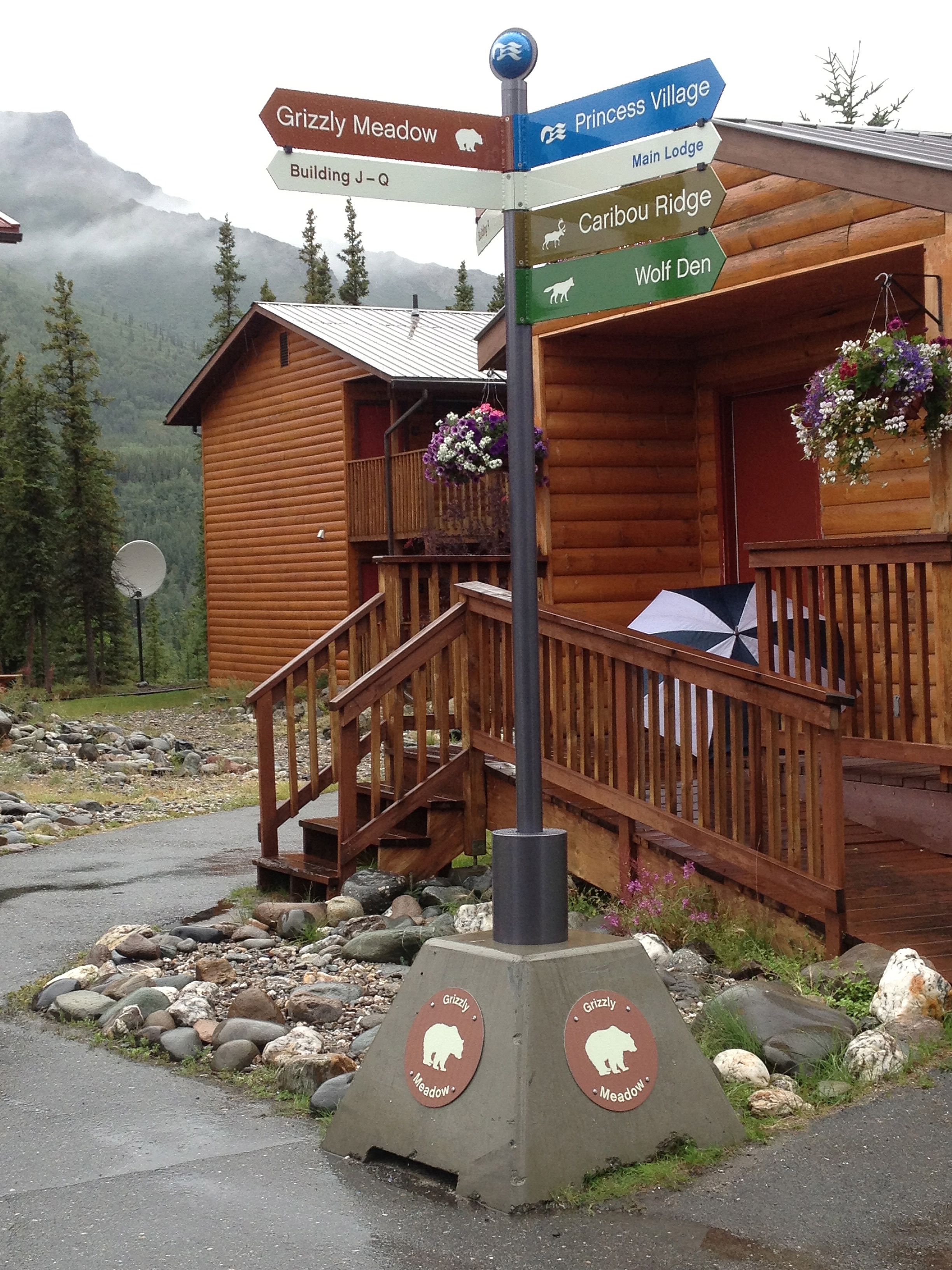
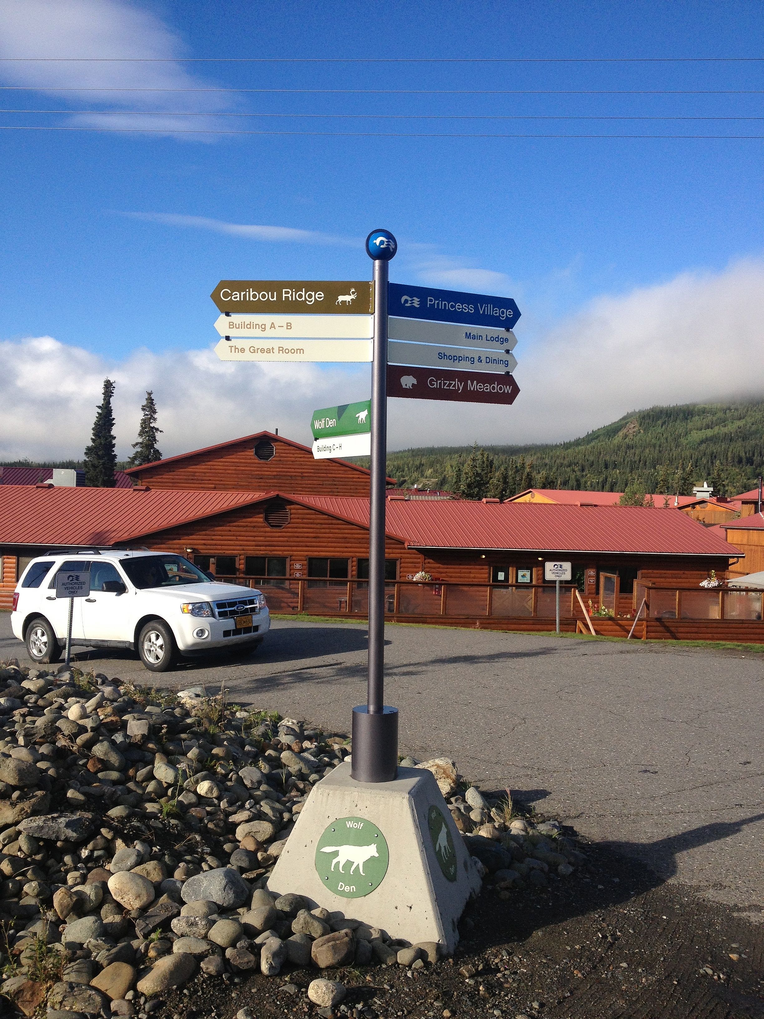
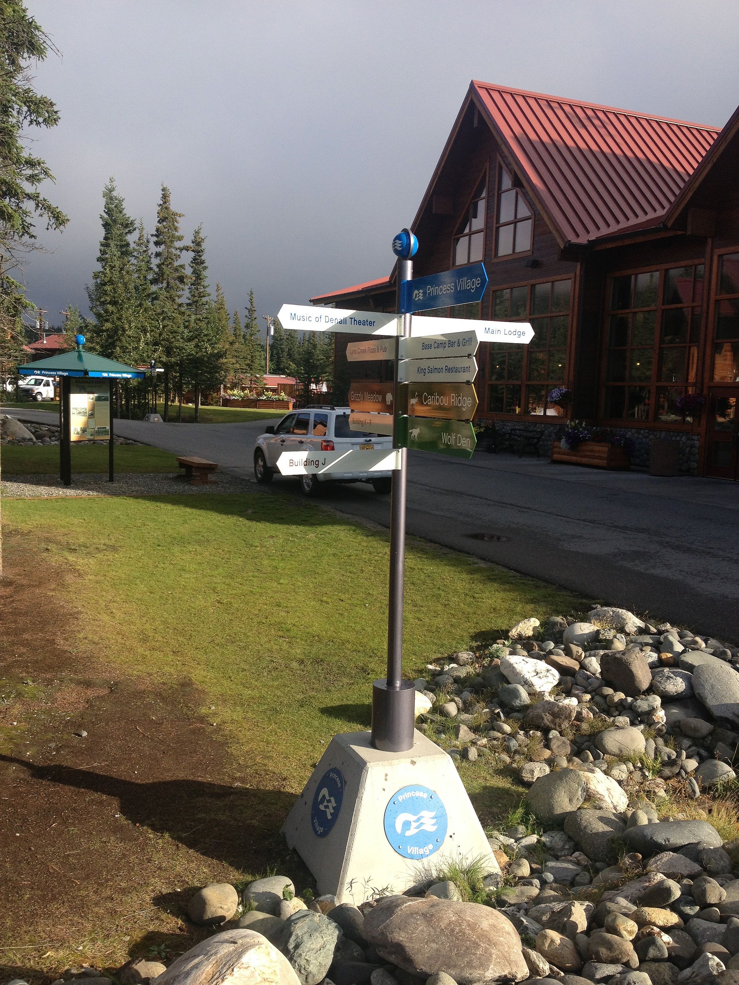
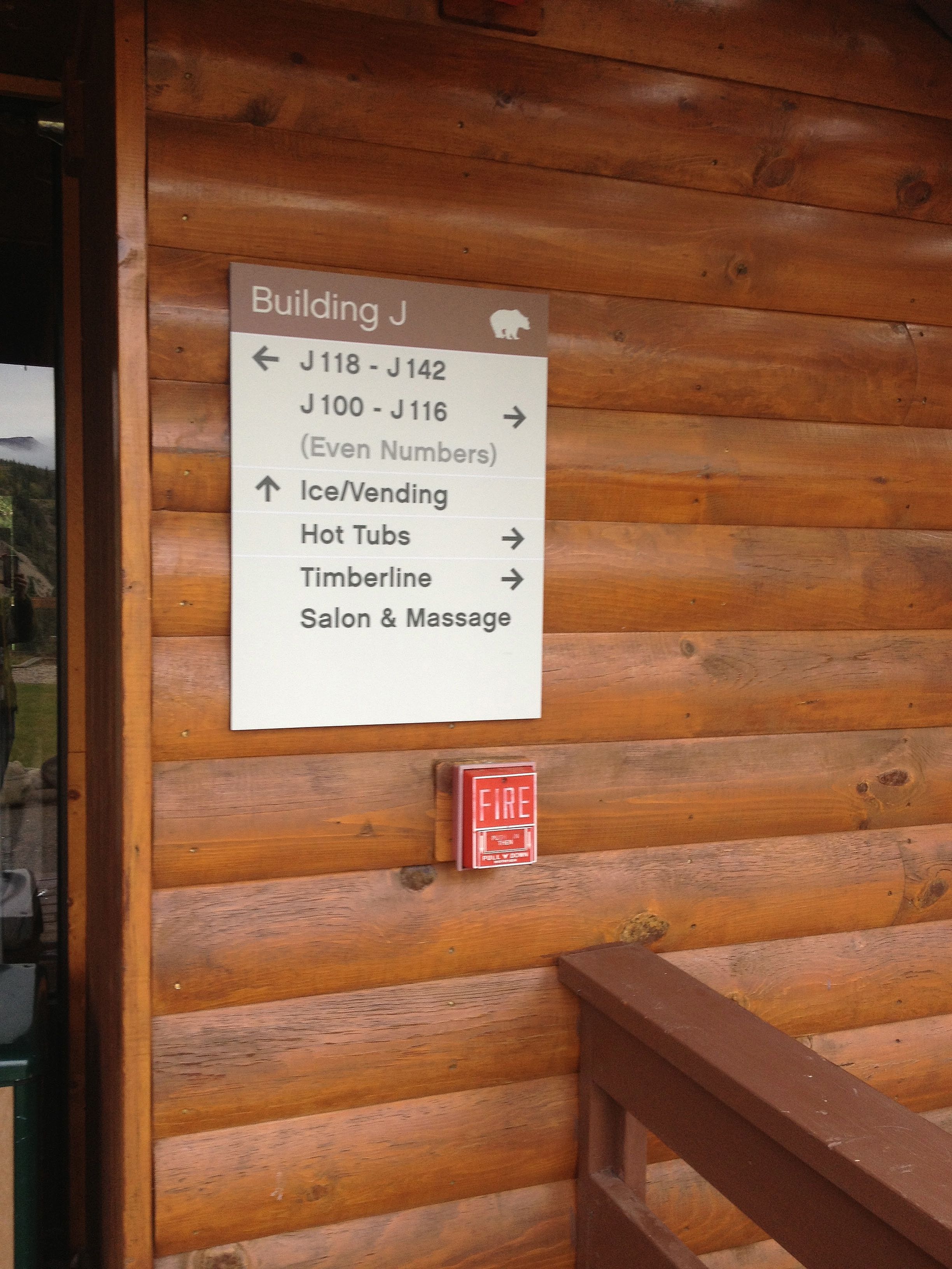
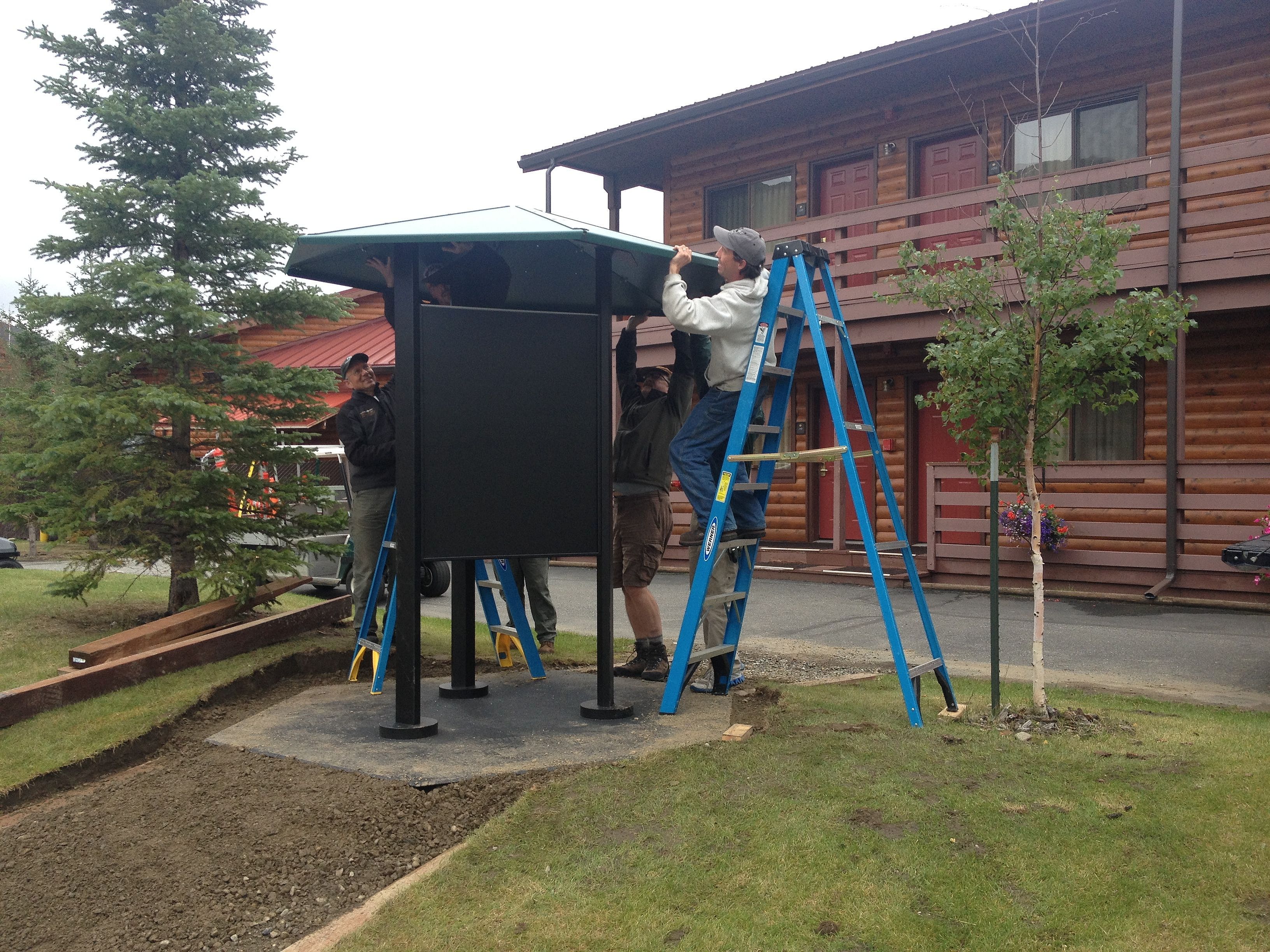
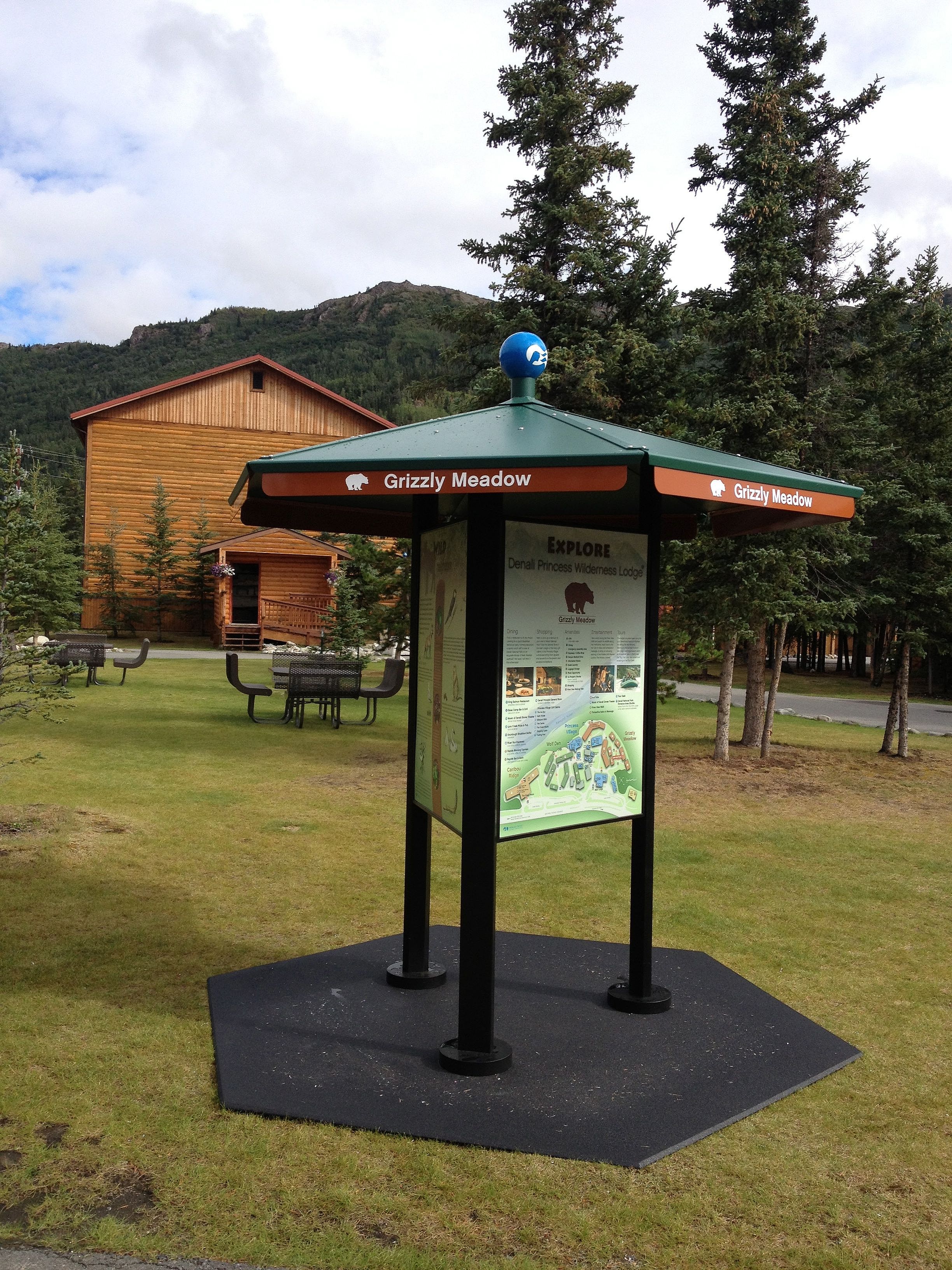
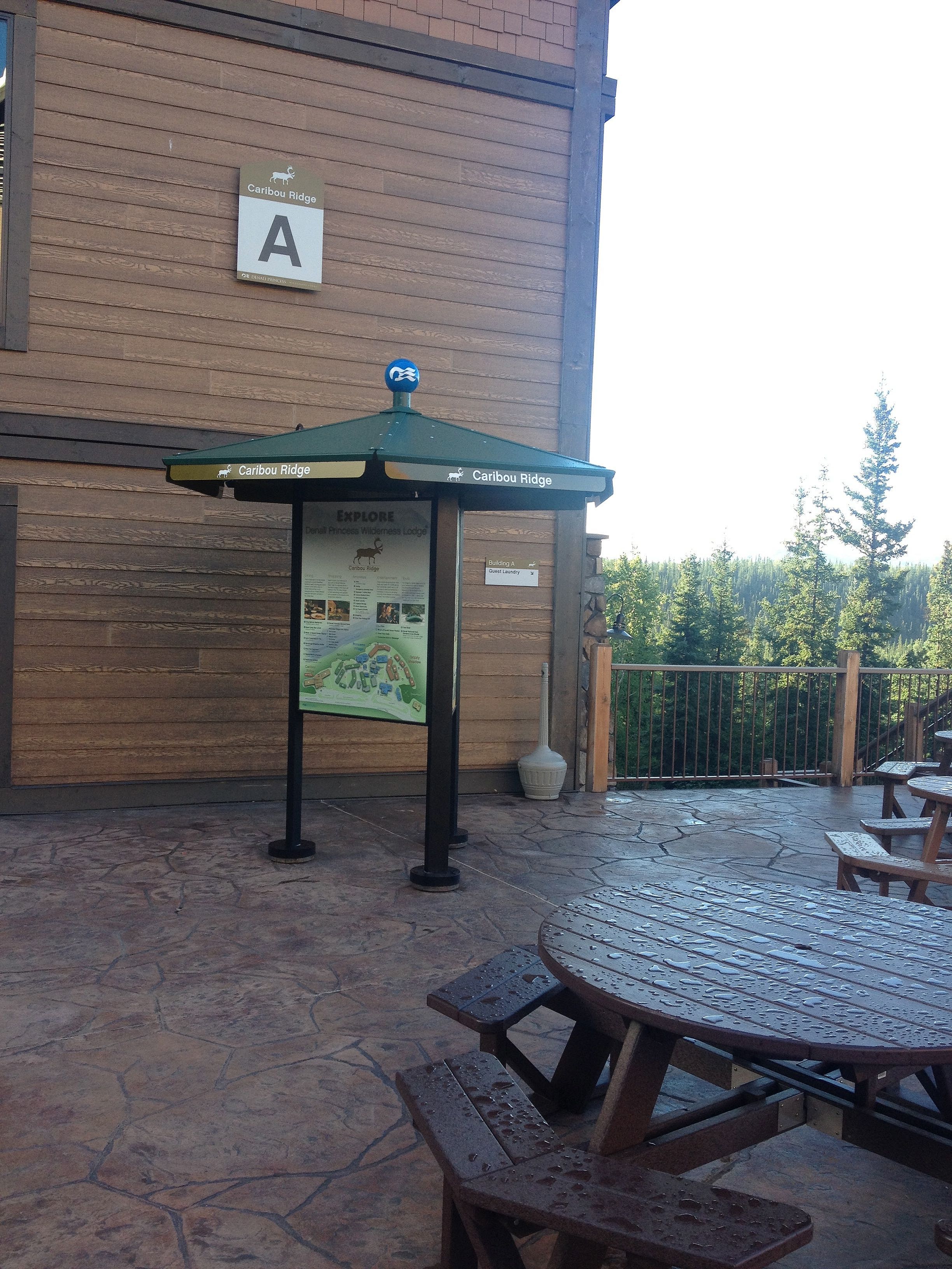
To enhance the visitor's experience and guide them along the 4-mile-long trail, a series of interpretive panels and maps were developed. They provide an overview of the diverse experiences and the history of the land on which the pathway meanders. A large woodcut illustration beckons the first time visitor as they approach the entrance providing a small taste of the wonders awaiting them on the trail.
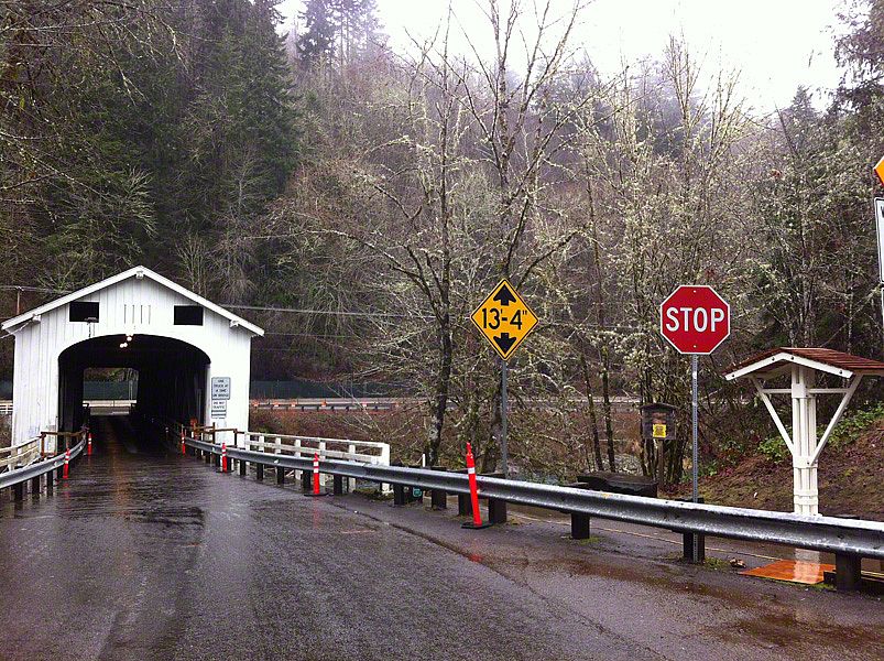
To further enhance the path's regional appeal, a bridge across the river is also in long-range plans. Such a bridge would provide access to Lane County's 2,300-acre Howard Buford Recreation Area and Mount Pisgah (another one of our projects), including 16 miles of trails.
